
Mockups play a pivotal role in the UI/UX design process, serving as the bridge between wireframes and prototypes. They are visual representations of a digital product, illustrating how the final design will look, including details like colors, typography, icons, and other design elements. In this blog post, we’ll explore what mockups are, why they are essential, and how to make mockups effectively in UI/UX design.
1. What Are Mockups?
Mockups are high-fidelity visual models of a product’s interface that demonstrate how the final version will appear to users. They go beyond simple wireframes by incorporating branding elements, color schemes, typography, and other visual elements to provide a realistic picture of the end product. Mockups are static and do not include interactive elements; instead, they focus on the aesthetic and visual structure of a product.
While wireframes prioritize layout and structure, and prototypes emphasize interaction and functionality, mockups bridge the gap by integrating these components visually. They are often used in presentations, design reviews, and client meetings to gain stakeholder approval and provide a clear direction for development.
2. Why Are Mockups Important in UI/UX Design?
Mockups are crucial in UI/UX design for several reasons:
- Visual Clarity: Mockups offer a clear, detailed visual representation of how the final product will look. This helps stakeholders and clients visualize the end result and gives designers a blueprint for development.
- Design Validation: By creating a mockup, designers can validate their design choices, such as color schemes, typography, and overall style, before moving into the prototyping phase.
- Client and Stakeholder Alignment: Mockups allow clients and stakeholders to see a realistic picture of the product early on. This minimizes the risk of misunderstandings and ensures that everyone involved is aligned before moving further in the development cycle.
- Efficient Iteration: With mockups, designers can make adjustments easily, incorporating feedback before investing resources into development. This streamlines the process, saving time and costs in the long run.
3. Types of Mockups in UI/UX Design
Before we delve into how to make mockups, it’s essential to understand the different types of mockups used in UI/UX design:
- Static Mockups: These are the most common form of website mockups, showing a single screen or page of the design. They focus on layout, color, typography, and spacing but do not include any interactive elements.
- Responsive Mockups: These mockups display the product on different screen sizes (e.g., mobile, tablet, and desktop) to ensure the design works well across various devices.
- Animated Mockups: These mockups include simple animations to demonstrate how certain components might move or interact within the interface, giving a slightly more dynamic feel, and often are used in Android mockup design.
4. Tools for Making Mockups
There are several tools available for creating mockups, each with its strengths and specialties. Here are some of the most popular ones:
- Lunacy: Lunacy is a powerful tool that allows designers to make mockups quickly. It offers a range of design tools, including vector editing, responsive design capabilities, and easy integration with other Icons8 products.
- Sketch: Known for its simplicity and efficiency, Sketch is widely used for UI/UX design, particularly in macOS environments. It has a rich ecosystem of plugins and templates that make it easy to create detailed and visually appealing mockups.
- Figma: Figma is a cloud-based design tool that supports real-time collaboration, making it ideal for teams working remotely. It combines the best features of wireframing, mockup creation, and prototyping, allowing for a seamless workflow.
- InVision Studio: InVision Studio offers advanced animation and prototyping capabilities, but it’s also a great tool for designing static and animated mockups. It allows for easy integration with other tools and provides a collaborative platform for designers and stakeholders.
- Canva: For those who prefer a more straightforward approach, Canva provides basic mockup features suitable for quick designs and presentations, though it may not have the advanced capabilities required for complex UI/UX projects.
5. How to Make Mockups: A Step-by-Step Guide
Now that we’ve covered what mockups are, why they’re essential, and the tools available, let’s dive into the step-by-step process of creating a mockup for a UI design.
Step 1: Define the Purpose and Scope
Before starting the mockup, it’s important to understand the project’s purpose and scope. Ask yourself:
- What is the goal of this mockup?
- Who is the target audience?
- Which screens or pages will the mockup cover?
- What elements must be included (e.g., buttons, navigation menus, forms)?
Having a clear objective and understanding of the project scope will guide the design choices you make during the mockup process.
Step 2: Start with Wireframes
Wireframes are the blueprint for your mockups. They focus on the layout, structure, and user flow without emphasizing visual details like colors and fonts. Before jumping into a high-fidelity mockup, create wireframes to establish the basic structure of your design. Tools like Figma, Sketch, or even simple pencil sketches can help you visualize the framework before adding details.
Step 3: Choose a Mockup Tool
Select a tool that fits your workflow and project needs. If you’re working in a team, a collaborative tool like Lunacy might be best. For individual projects or high-fidelity work, Sketch may be more suitable. Familiarize yourself with the tool’s features to maximize its potential during the mockup creation process.
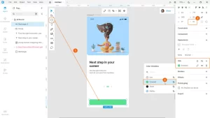
Step 4: Set Up the Canvas
Begin by setting up your canvas or artboard according to the device type you are designing for—whether it’s mobile, tablet, or desktop. Many mockup tools offer pre-defined templates for different screen sizes, which can be extremely helpful in ensuring your design adheres to standard dimensions and ratios.
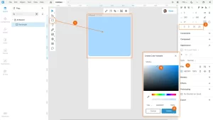
Step 5: Apply Visual Styles
This is where mockups diverge from wireframes. Start applying colors, typography, icons, and images to make your design come to life. Follow your brand’s style guide if one exists, or establish a visual hierarchy that aligns with your design goals.
- Color Scheme: Choose a color palette that aligns with the brand’s identity and enhances the user experience. Consider accessibility and contrast ratios to make your design inclusive.
- Typography: Select fonts that complement the overall style and ensure readability across different devices and screen sizes.
- Icons and Imagery: Use icons and imagery that enhance the design and guide users intuitively through the interface. Ensure that these elements are consistent in style and align with the visual theme.
Step 6: Add Realistic Content
Avoid using placeholder text like “Lorem Ipsum” for everything. Instead, use realistic content and images that match the context of the product. This makes the mockup appear more polished and professional, helping clients and stakeholders better visualize the final product.
Step 7: Create Variations
Design is an iterative process, and it’s always beneficial to explore multiple variations of your mockup. Create different versions to test various color schemes, layouts, or typography choices. This allows for more flexibility during feedback sessions and provides options to choose from.
Step 8: Gather Feedback and Iterate
Mockups should be reviewed collaboratively. Share your mockups with clients, team members, or stakeholders to gather feedback. Tools like Figma, InVision, and Adobe XD allow for real-time collaboration, where comments can be made directly on the design. Use this feedback to refine and adjust your mockup before proceeding to the next phase of the design process.
6. Best Practices for Creating Effective Mockups
- Keep It Realistic: The goal of a mockup is to represent the final product as closely as possible. Use real images, data, and components to ensure it feels authentic.
- Focus on Details: Attention to detail is key. Ensure elements like spacing, alignment, and consistency in style are precise to create a polished look.
- Stay Flexible: Be prepared to iterate based on feedback. Design is an evolving process, and mockups often require several revisions before they’re finalized.
- Use Grids and Guides: Utilizing grids and guides ensures that your layout remains consistent and balanced. Most design tools come with built-in grid systems that help in maintaining proportionality and alignment.
7. Conclusion
Mockups are an indispensable part of the UI/UX design process, bridging the gap between conceptual wireframes and interactive prototypes. They provide a detailed and realistic view of the final product, making them essential for client approval and development alignment. By following the steps and best practices outlined in this guide, designers can create effective and visually appealing mockups that streamline the design process and lead to successful product outcomes.
Whether you are a novice designer or a seasoned professional, mastering the art of making mockups is a crucial skill that enhances your design workflow and brings your digital products to life.
Also, check posts about and responsive website mockup and app mockups.