Gmail, Google’s popular email service, is known for its user-friendly interface and array of features that enhance communication and organization. One such feature is Gmail icons, which play a crucial role in providing visual cues and quick information about your emails. In this comprehensive guide, we will explore everything you need to know about Gmail icons and how they can streamline your email management experience.
Introduction to Gmail Icons
Gmail icons are small visual representations used to signify different attributes or states of an email. They appear alongside the subject lines in your Gmail inbox and convey essential information about the email’s status, priority, and contents.
Understanding the Different Gmail Icons
What Are Gmail Icons?
Before we delve into the specifics, it’s essential to understand the purpose of Gmail icons. These icons serve as visual aids to help users quickly grasp important details about their emails without even opening them.
Primary Icons in Gmail
Gmail utilizes a set of primary icons that you’ll frequently encounter while managing your inbox. These include the envelope icon for new messages, the arrow icon for forwarded emails, and the double-check mark for sent messages.
Label Icons
Label icons are associated with Gmail’s labeling system, allowing you to categorize your emails. These icons appear next to labeled messages and help you identify them quickly.
Inbox Icons
Inbox icons signal the state of an email concerning its read/unread status. These visual cues save you time by letting you know which emails require attention.
Attachment Icons
Attachment icons notify users about the presence of attachments in an email. This feature is particularly useful when you need to locate files or documents quickly.
How to Interpret Gmail Icons
Gmail uses distinct icons to differentiate read and unread messages. An unopened email will display a bold subject line along with an unread envelope icon, while a read email will have a normal font weight and no unread icon.
Gmail employs various icons to indicate the importance or priority level of an email. For instance, a red exclamation mark signifies high importance, whereas a yellow arrow indicates moderate importance.
Attachments are denoted by a paperclip icon, making it easy to identify emails containing files, images, or documents.
Customizing Gmail Icons
Google provides users with the option to customize Gmail icon styles to align with their preferences. By accessing Gmail settings, you can change the appearance of icons for a personalized experience.
In case you want to simplify your inbox view, Gmail allows you to enable or disable specific icons. This feature comes in handy when you find certain icons less useful for your workflow.
Troubleshooting Gmail Icons
If you notice that Gmail icons are missing, there may be some technical issues at play. We’ll explore common causes and troubleshooting steps to restore the icons.
Sometimes, you might encounter instances where Gmail icons don’t match their usual representations. We’ll guide you on how to address this problem effectively.
Enhancing Gmail Productivity with Icons
By leveraging Gmail icons effectively, you can significantly improve your email organization and management. We’ll share tips to enhance your productivity using these visual cues.
For those seeking to master Gmail icons, we have some advanced tips that will take your email productivity to the next level.
Gmail icons are invaluable tools for optimizing your email management. These small visual representations provide quick insights into your emails, making it easier to prioritize, categorize, and respond efficiently. Understanding and utilizing Gmail icons effectively will undoubtedly lead to a more streamlined and productive email experience.
FAQs
- Q: Can I customize the appearance of Gmail icons to my liking? A: Absolutely! Gmail allows you to personalize the icon styles according to your preferences.
- Q: How can I tell if an email has an attachment without opening it? A: Gmail conveniently displays a paperclip icon next to emails that contain attachments.
- Q: What do the red exclamation mark and yellow arrow icons signify? A: The red exclamation mark denotes high importance, while the yellow arrow indicates moderate importance.
- Q: Why are Gmail icons not showing up in my inbox? A: There could be technical issues causing this. Refer to our troubleshooting section for solutions.
- Q: Can I disable certain Gmail icons to declutter my inbox view? A: Yes, Gmail allows you to enable or disable specific icons based on your preferences.
The Evolution of Gmail Logo Over the Years
Introduction
In today’s digital era, email has become an integral part of our lives. One of the most popular email services, Gmail, has been constantly evolving to meet the changing needs of its users. Apart from its functional updates, Gmail has also undergone significant changes in its logo design over the years. In this article, we will take a journey through time to explore the fascinating evolution of the Gmail logo, from its inception to the present day.
The Birth of Gmail
The story of the Gmail logo starts back in 2004 when Google, the tech giant, decided to introduce its own email service. The initial Gmail logo was a simple and minimalistic representation of an envelope, symbolizing the concept of sending and receiving emails.
The Red M
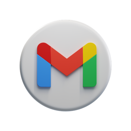
In 2011, Gmail underwent its first major logo update. The envelope icon was retained, but a new vibrant red color “M” was added to the logo. This change aimed to infuse a sense of energy and dynamism into the brand, capturing the essence of Google’s innovative approach.
The Material Design Makeover
With the introduction of Google’s Material Design philosophy in 2014, Gmail received a significant logo redesign. The envelope icon was replaced by a more stylized and flattened version, aligning with the clean and modern aesthetics of Material Design. This change reflected Google’s commitment to consistency and seamless user experiences across its products.
The Minimalistic Approach
In 2019, Gmail embraced a more minimalist approach in logo design. The envelope icon was further simplified, featuring a subtle gradient and refined lines. This redesign aimed to create a timeless and easily recognizable logo that could adapt to various platforms and screen sizes seamlessly.
The Current Logo
As of 2023, the Gmail logo has seen another update. The envelope icon remains at the core of the design, but it has undergone subtle modifications to maintain its relevance while still retaining its familiar charm. The color palette has been refreshed, reflecting Google’s branding updates and ensuring consistency across all its services.
The Impact of Branding
Gmail’s logo evolution is not merely a visual change but a strategic branding decision. Each update was intended to keep the brand fresh, dynamic, and in tune with the times. The constant evolution has allowed Gmail to stay ahead in the fiercely competitive email service market.
Adapting to User Preferences
The changes in the Gmail logo also reflect Google’s keen attention to user preferences. As users’ tastes and design preferences evolved, so did the logo. This adaptability demonstrates Google’s commitment to providing a user-centric experience.
The Logo’s Versatility
Another crucial aspect of the Gmail logo evolution is its versatility. The design changes ensured that the logo looked equally compelling across various platforms, be it on desktop, mobile devices, or even on promotional materials.
The Emotional Connect
The Gmail logo, despite its simplicity, has built an emotional connect with users over the years. It has become an integral part of daily communication for billions of people worldwide, making it a symbol of trust and reliability.
The Future Possibilities
As technology continues to advance, so will the Gmail logo. Google will likely continue to refine the logo, aligning it with future design trends and user expectations. The evolution of the Gmail logo will always remain a reflection of the ever-changing digital landscape.
The evolution of the Gmail logo is a journey of innovation, branding, and adaptability. From its humble beginnings as an envelope icon to the modern and minimalistic design we see today, the Gmail logo has grown alongside the service itself. It has played a pivotal role in establishing Gmail as one of the most iconic and beloved email services worldwide.
FAQs (Frequently Asked Questions)
- Has Gmail’s logo ever been completely overhauled? Yes, Gmail underwent a major logo overhaul in 2014 when Google introduced Material Design.
- Does the envelope icon have any symbolic significance? The envelope icon symbolizes the traditional concept of sending and receiving emails.
- How often does Gmail update its logo? Gmail’s logo has seen several updates over the years, with the most recent one in 2023.
- What is the rationale behind the logo changes? The logo changes are driven by branding strategy, user preferences, and design trends.
- Is the Gmail logo trademarked? Yes, the Gmail logo is a registered trademark of Google Inc.
Behind the Scenes: Gmail Logo Design
In today’s digital world, logos play a pivotal role in creating brand identities and fostering recognition. The Gmail logo, an essential element of Google’s email service, has undergone several transformations since its inception. In this article, we will delve into the evolution of the Gmail logo, the design process behind its current form, the psychology of color choices, typography considerations, and the public’s response to the changes. Let’s unravel the captivating story behind the iconic Gmail logo.
The Importance of Logo Design
A logo holds immense significance for a brand. It serves as the face of the company, communicating its values and creating a lasting impression on users.
Brand Identity
A well-designed logo helps establish a strong brand identity, making the brand easily recognizable and memorable. Gmail, as a part of Google’s suite of services, needed a logo that reflected the company’s core principles.
Recognition and Recall
An iconic logo aids in instant recognition. The Gmail logo’s evolution sought to create a distinctive symbol that users could identify effortlessly among the sea of apps and websites.
Communication of Values
A logo can communicate the brand’s essence and values. Google’s emphasis on simplicity, innovation, and user-centricity needed to be subtly conveyed through the Gmail logo.
The Concept Behind the Current Gmail Logo
Simplicity and Elegance
The current Gmail logo embodies simplicity, which aligns with Google’s design philosophy. The minimalist design ensures that the logo remains visually appealing and scalable across various platforms.
The Envelope Metaphor
The envelope icon, a nod to traditional mail, symbolizes the essence of Gmail as an email service. It bridges the gap between the digital and physical worlds, making the logo approachable and familiar.
Material Design Influence
Google’s Material Design principles heavily influenced the logo’s creation. The concept of tangible surfaces and consistent motion translated into a logo that felt alive and interactive.
Color Choice and Psychology
Color psychology played a vital role in the logo’s evolution. Red, the dominant color in the Gmail logo, signifies energy, passion, and urgency. It evokes excitement and encourages action, fitting for an email service.
Typography and Typeface Selection
The typography used in the Gmail logo went through meticulous consideration. The chosen typeface exudes modernity while maintaining legibility, reflecting Google’s focus on clear communication.
Iterative Design Process
Developing the current Gmail logo was not an overnight success. It involved an iterative design process, with multiple rounds of brainstorming, sketching, and refining ideas.
Collaboration and Feedback
The design team at Google worked collaboratively, bouncing ideas off one another to find the best possible representation of Gmail’s identity. User feedback was also crucial in shaping the logo’s final form.
The Final Design
After numerous iterations and feedback sessions, the design team settled on the iconic Gmail logo we know today. Its simplicity, elegance, and relevance to the brand made it the perfect representation of the email service.
The Unveiling of the New Logo
When the redesigned Gmail logo was unveiled in 2020, it created a buzz in the tech and design communities. The clean, modern look was met with anticipation and curiosity.
Public Reception and Feedback
As with any significant design change, the public’s response was diverse. Some praised the new logo for its freshness and alignment with Google’s overall visual identity, while others expressed nostalgia for the older versions.
Integration Across Platforms
The Gmail logo found its place across various platforms, from mobile apps to browser tabs, seamlessly integrating with users’ digital lives.
Icon Variations and Adaptations
To cater to different devices and screen sizes, variations of the Gmail logo were created, ensuring a consistent experience across platforms.
The Future of Gmail Logo Design
With design trends constantly evolving, the future of the Gmail logo remains dynamic. Google will continue to adapt its visual identity, always striving for innovation while staying true to its core values.
The journey of the Gmail logo reveals the thought and creativity that go into creating a symbol that captures a brand’s essence. From its humble beginnings to its present form, the Gmail logo has evolved to embody Google’s principles while staying relevant to users worldwide.
FAQs
- Q: Why did Google redesign the Gmail logo?
- A: Google aimed to align Gmail’s design with its overall visual identity, emphasizing simplicity and user-centricity.
- Q: What does the red color in the Gmail logo signify?
- A: The red color represents energy, passion, and urgency, encouraging users to take action.
- Q: How did user feedback influence the logo’s design?
- A: User feedback played a crucial role in refining the logo’s elements and ensuring it resonated with the audience.
- Q: How has the Gmail logo changed over the years?
- A: The logo has evolved from a simple blue and red M to a minimalist, modern envelope design.
- Q: Will Google make more changes to the Gmail logo in the future?
- A: As design trends evolve, it is possible that Google will continue to refine the Gmail logo while keeping it consistent with its brand identity.
Created with AIPRM Prompt “Human Written |100% Unique |SEO Optimized Article”
Outline:
- Introduction
- The Power of Visual Branding
- Evolution of the Gmail Logo
- From M to Envelope
- Incorporating Google’s Color Palette
- The Significance of Color Choice
- Psychological Impact
- Google’s Color Psychology
- Simplicity and Recognizability
- Minimalistic Design Approach
- Enhancing Brand Identity
- Consistency Across Platforms
- Seamless Brand Experience
- Mobile App Adaptation
- Gmail Logo and Emotional Connection
- Nostalgia and Familiarity
- Emotional Bonding with Users
- Gmail Logo vs. Competitors
- Standing Out from the Crowd
- Reinforcing Google’s Dominance
- Logo Redesign Controversies
- Embracing Change
- User Feedback and Adaptations
- The Gmail Logo as a Marketing Tool
- Promotional Merchandise
- Branding Partnerships
- Incorporating the Logo into Email Marketing
- Brand Awareness Campaigns
- Email Signature Branding
- User Perception and Trust
- Logo as a Trust Indicator
- Impact on Email Security
- The Gmail Logo’s Role in App Recognition
- Iconic Symbolism
- Fostering App Loyalty
- Future Possibilities and Trends
- Evolving Design Trends
- Interactive Logos and Animation
- Conclusion
Significance of Gmail Logo in Branding
In the digital era, branding has become a powerful tool for businesses to establish a unique identity and connect with their audience. Visual branding, in particular, plays a pivotal role in creating a lasting impression on consumers. One prime example of the significance of visual branding is the iconic Gmail logo.
The Power of Visual Branding
Visual branding serves as the face of a company, communicating its values, personality, and offerings at a glance. When done right, it can leave a memorable impact on users, leading to enhanced brand recognition and loyalty. The Gmail logo stands as a perfect embodiment of effective visual branding that resonates with millions of users worldwide.
Evolution of the Gmail Logo
Over the years, the Gmail logo has undergone a significant transformation. From its early days, where it was simply an ‘M’ representing “Mail,” to the current envelope design, the logo has evolved along with the platform’s growth.
Incorporating Google’s Color Palette
One of the notable aspects of the Gmail logo’s evolution is its alignment with Google’s recognizable color palette. The use of primary colors, specifically red, blue, green, and yellow, in the logo showcases a deliberate effort to align Gmail with the broader Google brand.
The Significance of Color Choice
Colors hold immense psychological influence on human emotions and behavior. Google, being a master in the art of psychology-based branding, has made effective use of colors in the Gmail logo to evoke certain feelings and associations.
Simplicity and Recognizability
The beauty of the Gmail logo lies in its simplicity. The minimalist design approach not only makes it visually appealing but also facilitates easy recognition, even in cluttered digital spaces.
Consistency Across Platforms
Google’s commitment to maintaining a consistent brand experience is evident in the way the Gmail logo seamlessly translates across various platforms and devices. This consistency reinforces Gmail’s identity and user trust.
Gmail Logo and Emotional Connection
Beyond being just a visual element, the Gmail logo has formed an emotional connection with users. It evokes a sense of nostalgia, reminding people of the time they first adopted Gmail as their primary email service.
Gmail Logo vs. Competitors
In a fiercely competitive market, a distinctive logo can set a brand apart from its rivals. The Gmail logo has effectively contributed to Google’s dominance in the email service industry.
Logo Redesign Controversies
As with any logo redesign, the changes to the Gmail logo have not been without controversy. However, user feedback and Google’s adaptability have led to smoother transitions and wider acceptance.
The Gmail Logo as a Marketing Tool
Beyond its primary role as a brand identifier, the Gmail logo serves as a powerful marketing tool. Companies leverage the logo on promotional merchandise to increase brand visibility and recognition.
Incorporating the Logo into Email Marketing
Businesses capitalize on the popularity of the Gmail logo in their email marketing efforts. Including the logo in brand awareness campaigns and email signatures strengthens brand recall.
User Perception and Trust
Logos, including the Gmail logo, act as trust indicators for users. A recognizable logo reinforces the credibility of a brand and fosters a sense of security in users’ minds.
The Gmail Logo’s Role in App Recognition
The Gmail logo goes beyond the web interface and holds a vital role in app recognition. The iconic envelope symbol becomes synonymous with email communication on mobile devices.
Future Possibilities and Trends
As design trends evolve, so will logos. The Gmail logo is likely to adapt to future design trends and may incorporate interactive elements or animation to stay fresh and engaging.
Conclusion
The Gmail logo has undoubtedly played a pivotal role in Google’s branding success story. Its evolution, color choice, simplicity, and adaptability have contributed to its iconic status. As Google continues to dominate the email service landscape, the significance of the Gmail logo in branding remains paramount.
FAQs
- Q: Can a logo really influence user perception? A: Yes, a well-designed logo can evoke emotions, create connections, and shape user perception about a brand.
- Q: Why does Google use primary colors in its logo? A: Primary colors are vibrant and easily recognizable, creating a sense of familiarity and friendliness.
- Q: How can businesses benefit from incorporating logos into email marketing? A: Including logos in email marketing reinforces brand identity and increases brand recall among recipients.
- Q: What impact does brand consistency have on user trust? A: Consistent branding builds trust and reliability, enhancing user confidence in a brand.
- Q: Is the Gmail logo likely to change in the future? A: As design trends evolve, logo changes are possible, but Google will likely prioritize maintaining brand recognition and user familiarity.
Ultimate Guide to Gmail Symbols
Gmail, one of the most widely used email services, offers a plethora of features to enhance communication. Among these are Gmail symbols, which provide users with a creative and expressive way to communicate emotions, ideas, and messages. In this comprehensive guide, we will explore the world of Gmail symbols and how to use them effectively to make your emails stand out.
Introduction to Gmail Symbols
In the modern digital age, written communication often lacks the nuances of face-to-face interactions. This is where Gmail symbols come into play. These symbols add depth and emotion to emails, making the message more engaging and personal. From smiley faces to arrows and stars, Gmail symbols offer a diverse range of options to express oneself.
Understanding Gmail Symbol Basics
Before diving into the world of Gmail symbols, it’s essential to know where to find them and how to insert them into your emails. Gmail provides a user-friendly interface that allows easy access to a vast collection of symbols. Inserting them into your emails is as simple as a few clicks.
Gmail Symbol Categories
Gmail symbols are organized into various categories, each serving a different purpose. Emoticons and emoji are perfect for adding emotions, while arrows and icons can be used for emphasis or direction. Stars and asterisks help draw attention, and currency symbols are useful for international transactions.
How to Use Gmail Symbols in Emails
The strategic placement of symbols in emails can significantly impact the overall message. We’ll explore how to add symbols to subject lines to make them eye-catching, as well as using them within the body of the email to reinforce key points or simply to create a more cheerful tone.
Conveying Emotions with Gmail Symbols
Sometimes, words alone cannot adequately express emotions. With Gmail symbols, users can add that missing emotional context to their emails. From happiness to sadness, and everything in between, we’ll discover how emoticons and emoji can convey feelings effectively.
Gmail Symbols for Professional Communication
While symbols add a touch of informality to emails, they can also be used professionally to enhance communication. We’ll explore how symbols can be subtly incorporated into business emails and even added to email signatures to leave a lasting impression on recipients.
Gmail Symbols for Personal Use
In more casual settings, Gmail symbols can be a fun way to brighten someone’s day. Whether it’s between friends, family, or romantic partners, we’ll explore the different ways symbols can be used to add a touch of warmth and playfulness to personal emails.
Commonly Used Gmail Symbols and Their Meanings
To use symbols effectively, it’s crucial to understand their meanings and connotations. We’ll take a closer look at some of the most popular Gmail symbols and the messages they convey to avoid any potential misunderstandings.
Tips for Using Gmail Symbols Effectively
While Gmail symbols can enhance communication, it’s important not to overdo it. We’ll provide valuable tips on using symbols thoughtfully, maintaining professionalism, and ensuring that the symbols add value to the message without overwhelming the recipient.
Accessibility and Compatibility of Gmail Symbols
As digital communication takes place on various devices and platforms, we need to ensure that the symbols we use are accessible to all recipients. We’ll discuss compatibility issues and consider the use of symbols with screen readers for visually impaired individuals.
Gmail Symbols for Marketing and Promotions
In the world of email marketing, grabbing the reader’s attention is vital. We’ll explore how marketers can utilize Gmail symbols to create eye-catching subject lines, engage subscribers, and promote products and services effectively.
Gmail Symbols and International Communication
Symbols may hold different meanings across various cultures. When communicating internationally, it’s essential to be mindful of potential cultural differences to avoid misinterpretation and unintentional misunderstandings.
Security and Privacy Concerns with Gmail Symbols
While Gmail symbols can add flair to emails, they can also pose security risks. We’ll discuss potential issues with using unrecognized symbols and provide tips on protecting sensitive email content.
Gmail symbols are a fantastic tool to make emails more engaging and expressive. By incorporating them thoughtfully, users can add a touch of personality and emotion to their messages, making their communication more impactful. As with any feature, it’s essential to use Gmail symbols wisely and consider the context and the recipient’s preferences.
Also, check Thanksgiving icons collection, and Minecraft desktop icons collection.