The digital world bombards us with information: text, images, videos, animations. In this overflowing landscape, how can you ensure your message cuts through the noise and resonates with users? The answer lies in the subtle yet powerful language of UX icons.
These tiny visual cues are more than just decorations; they’re silent guides, intuitive shortcuts, and instant translators for complex concepts. Think of them as visual breadcrumbs leading users on a smooth journey through your interface.
Why are UX icons so important?
- Clarity and Efficiency: They communicate complex actions and functions instantly, saving users time and cognitive effort. A shopping cart icon instantly tells users where to check out, while a magnifying glass screams “search.”
- Universal Language: Icons transcend language barriers, making your interface accessible to a global audience.
- Visual Appeal: Well-designed icons add a touch of personality and polish to your interface, enhancing its overall aesthetics.
- Improved Usability: By guiding users intuitively, icons reduce friction and contribute to a positive user experience.
Building Your UX Icon Collection:
Now that you understand the power of icons, it’s time to curate your own collection. Here are some tips:
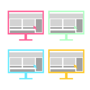
- Consistency is Key: Choose a consistent style, theme, and size for your icons to maintain visual harmony throughout your interface.
- Clarity over Creativity: While you can have fun with design, prioritize clarity and ensure your icons are easily understood by all users.
- Accessibility Matters: Use high-contrast colors and consider alternative text descriptions for users with visual impairments.
- Free vs. Paid Resources: Explore both free and paid icon sets depending on your budget and specific needs. Popular free options include Font Awesome, Noun Project, and Material Design Icons.
- Don’t Reinvent the Wheel: Utilize existing industry standards whenever possible. For example, a gear icon universally represents settings.
Remember: Your UX icon collection is a living entity. Keep it updated with new trends and iterate based on user feedback to ensure it continues to serve your interface and your users effectively.
Ready to unleash the power of UX icons? Start building your collection today and watch your user experience soar!
Bonus:
- Include some visuals in your blog post, such as examples of well-designed UX icons and before-and-after comparisons demonstrating their impact.
- Offer actionable tips on how to choose and implement icons effectively.
- Share resources for finding high-quality icon sets.
- Encourage readers to share their own experiences and best practices with UX icons in the comments section.
By providing valuable information and engaging your audience, you can make your blog post a go-to resource for anyone looking to elevate their UX design with the power of icons.
Beyond the Basics: Diving Deeper into the World of UX Icons
While the previous section established the foundation for building powerful UX graphics, let’s delve deeper into specific strategies and considerations to maximize their impact.
Choosing the Right Style:
Icon styles range from the flat and minimalistic to the richly detailed and illustrative. The optimal choice depends on several factors:
- Overall brand aesthetic: Align your icon style with your brand identity for a cohesive look and feel.
- Target audience: Consider demographics and preferences when selecting a style that resonates with your users.
- Interface complexity: If your interface is already visually intricate, opt for simpler icons to avoid clutter.
- Usability goals: Prioritize readability and clarity, especially for icons representing critical actions.
The Art of Meaningful Details:
Even within a chosen style, there’s room for creative expression. Consider these details to inject personality and enhance usability:
- Line weight and direction: Thicker lines suggest importance, while diagonal lines can imply action or dynamism.
- Negative space: Utilize negative space effectively to create clear distinction between elements and enhance readability.
- Color psychology: Play with color palettes to evoke specific emotions or align with brand guidelines.
- Microinteractions: Subtle animations on hover or click can add a touch of delight and reinforce user interactions.
Icon States: Telling the Full Story:
Icons come alive when they adapt to different user interactions and system states. Common states include:
- Default: The icon’s resting state, clearly communicating its function.
- Hover: Subtle visual changes indicating potential interaction when hovered over.
- Active: Signals successful user interaction and provides feedback.
- Disabled: Grayscaled or faded icons communicate unavailable functionality.
Microinteractions for Enhanced Engagement:
Subtle animations can breathe life into your icons and elevate user experience. Explore these possibilities:
- Smooth transitions: Use animations for state changes or interactions to create a fluid and intuitive experience.
- Hover effects: Subtle color changes, glows, or micro-movements can draw attention and encourage user interaction.
- Feedback animations: Provide visual confirmation of actions, such as a checkmark animation for successful submissions.
Accessibility: A Must-Have, Not an Afterthought:
Inclusive design is paramount, and icons must cater to diverse user needs. Ensure:
- High contrast: Use adequate contrast between icons and backgrounds for optimal visibility.
- Alternative text: Provide descriptive text for screen readers or users with visual impairments.
- Color blindness considerations: Avoid relying solely on color for meaning and employ alternative design elements for clarity.
Beyond the Screen: Expanding the Reach of Your Icons:
Remember, icons aren’t limited to digital interfaces. Consider their potential in:
- Marketing materials: Utilize icons in flyers, presentations, and social media graphics for brand consistency and visual appeal.
- Physical products: Integrate them into product packaging, signage, or user manuals for intuitive guidance.
- Merchandise: Branded merchandise featuring your icons can foster brand loyalty and community engagement.
Also, check the Windows 11 Folder icons collection and Windows 11 Folder icons pack.
Conclusion: Icons – The Unsung Heroes of UX Design
By investing time and effort into crafting a well-designed UX icon collection, you unlock a powerful tool for enhancing user experience, communication, and brand identity. Remember, icons are not mere decorations; they are silent storytellers, guiding users seamlessly through your digital landscape. So, unleash your creativity, embrace best practices, and let your icons speak volumes in the language of intuitive design.