
The search icon is more than just a functional element within an app; it’s a crucial interface tool that significantly influences user behavior and engagement. By guiding users efficiently to search functionalities, a well-designed icon can improve an app’s overall usability. This article aims to arm app developers with effective strategies for crafting a search icon that is both visually appealing and functionally superior.
Understanding Search Icon Basics
Search icons serve as primary navigational aids in most digital applications, providing users with a direct and straightforward means to access search features. The design and placement of these icons are pivotal, as they affect how quickly and easily a user can navigate the app. Optimal search icon design should reduce search times and enhance overall user experience, making the app more intuitive and enjoyable to use.
Key Design Principles
- Simplicity: A search icon should be simple enough to be understood at a quick glance. Overly complex icons can confuse users and hinder the app’s usability. The icon should convey its function through a minimalistic design that avoids unnecessary embellishments.
- Visibility: The search icon must be prominently displayed within the app’s interface for maximum effectiveness. It should be located in an area that is consistently accessible, such as the top corner of the app, and designed with colors and sizes that contrast well with the background to ensure it catches the user’s eye.
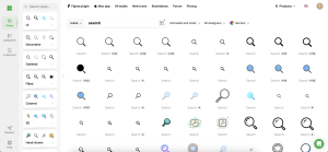
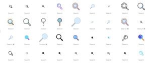
- Intuitive Design: The icon’s design should immediately suggest its function to prevent any user confusion. Using universally recognized symbols, like the magnifying glass, can effectively convey the purpose of the search icon.
Choosing the Right Symbol
While the magnifying glass remains a strong choice because of its universal recognition, there’s room for creativity in symbol selection, especially for brands looking to differentiate their interface. Custom icons can reflect a unique brand personality but must remain intuitive. When deviating from standard symbols, it’s crucial to ensure that the new design still communicates the search function clearly and effectively.
Integration with App Design
Ensuring that the search icon fits well within the app’s overall design is crucial for maintaining visual harmony. The icon should complement other UI elements in style, color, and size, reinforcing the app’s visual theme and enhancing the cohesive feel of the user interface. This consistency helps to strengthen the app’s brand identity and improves the overall aesthetic appeal.
Technical Considerations
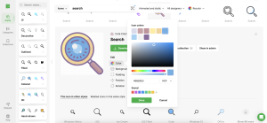
Technical execution is key in icon design. The icon must be scalable to fit different screen sizes and resolutions without losing clarity. Developers should consider vector graphics to ensure icons maintain their definition and aesthetics on various devices. Additionally, it’s important to design with different platforms in mind, as an icon that works well on iOS might need adjustments for optimal display on Android.
User Testing and Feedback
User feedback is invaluable in refining the search icon. Conducting usability tests, such as A/B testing, allows developers to compare different icon designs and understand which one provides the best user experience. Gathering direct feedback from users can also reveal unforeseen issues with the icon’s design or placement, which can then be adjusted accordingly.
Case Studies and Examples
Examining successful search icon implementations can provide clear insights into effective design practices. For instance, a study might reveal that a particular app saw increased user engagement after redesigning its search icon to be more prominent and easier to recognize. These real-world examples can serve as a guide and inspiration for developing effective search icons.
Tools and Resources
A variety of tools are available to assist in the design and testing of search icons. Icons8 offers a comprehensive suite of design tools that includes a wide range of editable icons and user interface elements. These tools allow for easy customization and testing of icons, making it simpler for developers to iterate on their designs based on user feedback and testing outcomes.
Conclusion
Creating the perfect search icon is a critical task that combines aesthetic design with functional precision. By focusing on simplicity, visibility, and intuitive design and utilizing the right tools, app developers can craft icons that look great and enhance user interaction and overall app performance.
Call to Action
Embrace the challenge of designing or refining your app’s search icon. Utilize the strategies discussed and tools like those offered by Icons8 to explore creative and effective solutions. Share your progress and insights with the developer community, and continue to evolve your app based on user interaction and feedback. Together, we can push the boundaries of what makes an app truly user-friendly and successful.