
In the landscape of app design, menu icons are not merely decorative elements; they are pivotal in guiding users through their digital journeys. These small graphical elements significantly impact both navigation and the overall aesthetic of an application.
The Importance of Menu Icons in User Experience
Menu icons act as the primary touchpoints for user interaction within an app. They help streamline navigation, reducing the cognitive load on users by providing intuitive and accessible paths to follow. The efficiency of an app’s usability often hinges on the clarity and effectiveness of its menu icons.
Design Principles for Menu Icons
- Simplicity and Recognizability: Simple, clear icons are immediately recognizable, which is crucial in fast-paced user environments. An effective icon should convey its function without the need for text labels, enabling a smoother user experience.
- Consistency Across the App: Consistency in icon design ensures that users can easily infer the rest once they learn one part of your app’s interface. This uniformity reduces confusion and builds user confidence as they navigate through various features.
- Contextual Appropriateness: Icons should be designed to fit the theme and purpose of the app and adapt to the environment in which they are used. This includes considering the cultural and demographic factors that might influence icon perception and effectiveness.
Technical Aspects of Designing Menu Icons
- Size and Resolution Considerations: Icons must be clearly visible and recognizable across all device resolutions and sizes. Designing with scalability in mind ensures that icons maintain their integrity and functionality regardless of the screen they are displayed on.
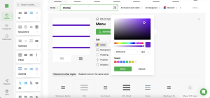
- Color Usage and Accessibility: Choosing the right color palette is essential for aesthetic integration, visibility, and accessibility. High contrast and color-blind-friendly palettes ensure that icons are usable by a wider audience, including those with visual impairments.
User-Centric Approach to Icon Design
Understanding the target audience is critical when designing menu icons. Engaging with users through surveys, interviews, and usability testing provides invaluable insights that can shape icon design to meet user expectations and improve overall app usability.
Integrating Icons with the App Interface
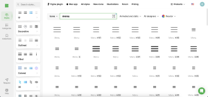
Icons should seamlessly integrate into the app’s design, supporting easy navigation without overwhelming the user. Tools like Icons8 offer a wide array of ready-to-use icons that can be easily adapted to any app’s design, ensuring consistency and quality.
Testing and Iteration
Effective icon design is an iterative process. Continuous testing within the app environment helps designers understand how icons perform in real-world scenarios, allowing for adjustments based on direct user feedback. This approach ensures that the icons not only look good but also function well across different contexts and user groups.
Conclusion
Well-designed menu icons are essential for creating a smooth and intuitive user experience in app design. They guide users effortlessly, enhance the app’s aesthetic appeal, and play a crucial role in usability. By utilizing resources like Icons8, designers can ensure that their icons are beautiful and effective in fulfilling their navigational roles. Constant evaluation and refinement based on user feedback are key to maintaining the effectiveness of these icons.
By adhering to these principles and continuously engaging with user feedback, app developers can harness the full potential of menu icons to enhance app navigation and user satisfaction.
Also, check posts about app mockups, responsive mockup design and UI/UX mockup design.