Settings icons have become an integral part of digital user interfaces, guiding users through the complex web of functionality that modern software and applications offer. As digital landscapes continue to evolve, the importance of well-designed settings icons in enhancing user experience (UX) becomes more evident. This blog post will explore how settings icons contribute to UX, the principles behind effective icon design, and the impact of these icons on accessibility and usability.
Understanding Settings Icons
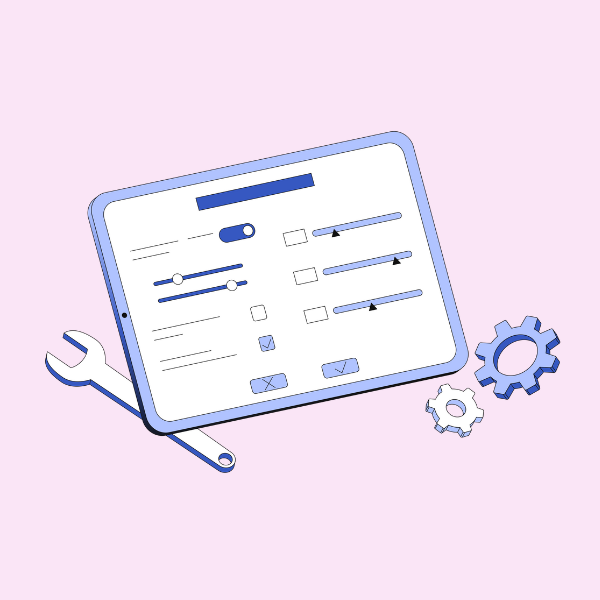
Settings icons are graphical representations that lead users to configuration or customization options within an application, website, or digital device. They typically symbolize tools, gears, sliders, or other visual cues indicating adjustability or modification. These icons are not just decorative elements; they serve as intuitive navigational tools that facilitate user interaction with digital products.
The Importance of Settings Icons in User Experience
![]()
A well-designed settings icon can significantly improve user experience in several ways:
- Intuitive Navigation: Settings icons guide users to the configuration options they need without requiring extensive explanations or text. This intuitive approach reduces cognitive load, making it easier for users to find and use features.
- Consistency Across Platforms: Consistent use of settings icons across platforms and applications helps users quickly recognize their function. This familiarity allows users to transition smoothly from one platform to another without a steep learning curve.
- Improved Accessibility: Settings icons can enhance accessibility for users with disabilities. By providing clear visual cues, users with limited vision or other impairments can quickly identify the settings options without relying solely on text.
- Reduced Screen Clutter: Icons take up less screen real estate than text-based navigation elements. This allows for cleaner, more organized interfaces, reducing visual clutter and improving overall aesthetics.
- Enhanced User Control: Settings icons empower users to customize their digital experiences. This sense of control contributes to a positive user experience, fostering user satisfaction and loyalty.
Principles of Effective Settings Icon Design
Designing effective settings icons requires a balance between creativity and clarity. Here are some key principles that guide successful icon design:
- Simplicity: The most effective settings icons are simple and easy to understand. Complex or overly detailed icons can confuse users and diminish their effectiveness.
- Universality: Icons should be universally recognizable. Using widely accepted symbols like gears, sliders, or wrenches ensures that users can easily identify their function regardless of cultural or linguistic differences.
- Consistency: Consistency in icon design and placement across different interfaces is crucial. This consistency reinforces user expectations and reduces the learning curve when transitioning between platforms.
- Scalability: Icons should be designed to remain clear and legible at various sizes and resolutions. This scalability is essential for ensuring usability on different devices, from smartphones to large desktop screens.
- Accessibility: Icons should be accessible to all users, including those with disabilities. This means providing alternative text descriptions, ensuring proper color contrast, and considering other accessibility guidelines.
The Impact of Settings Icons on Accessibility and Usability
Accessibility and usability are central to creating a positive user experience. Settings icons play a significant role in both areas, offering several benefits:
- Accessibility: Settings icons can improve accessibility by providing alternative text descriptions for screen readers. This allows users with visual impairments to navigate digital interfaces more effectively. Additionally, using high-contrast colors and clear shapes enhances accessibility for users with color vision deficiencies.
- Usability: Usability refers to how easy and efficient it is for users to accomplish their goals within an application or website. Settings icons contribute to usability by providing a clear path to configuration options. This reduces the need for users to search for hidden settings or navigate complex menus.
- Reducing User Frustration: A well-placed settings icon can significantly reduce user frustration. When users can quickly access the settings they need, they are less likely to abandon an application or website due to confusion or difficulty in finding customization options.
Best Practices for Implementing Settings Icons
To make the most of settings icons, designers and developers should follow best practices that align with the principles of effective design. Here are some recommendations:
- Consistent Placement: Place settings icons in consistent locations across different interfaces. This consistency helps users know where to look for configuration options.
- Clear Labeling: Although icons are intended to be intuitive, providing clear labels or tooltips can further clarify their function. This additional context benefits users who may not immediately recognize the icon’s meaning.
- Provide Redundancy: While settings icons are valuable, they should not be the only method for accessing configuration options. Providing additional text-based menus or navigation pathways ensures that users with different preferences or accessibility needs can still find what they’re looking for.
- Test with Users: Conduct usability testing to evaluate the effectiveness of settings icons. This feedback helps identify any potential issues with icon design or placement, allowing for adjustments to improve user experience.
- Maintain Flexibility: While consistency is crucial, allowing users to customize their interface to some extent can enhance user experience. Providing options to rearrange settings icons or create shortcuts gives users greater control over their digital environment.
Conclusion
Settings icons play a critical role in enhancing user experience by providing intuitive navigation, improving accessibility, and reducing screen clutter. By following principles of effective design and implementing best practices, designers can create settings icons that are both functional and visually appealing. As digital interfaces continue to evolve, the importance of these icons in guiding users through complex functionality will only grow.
By prioritizing simplicity, universality, consistency, scalability, and accessibility, developers and designers can ensure that settings icons contribute to a positive user experience. Ultimately, the goal is to create digital environments where users feel empowered, satisfied, and in control—settings icons are a key component in achieving that objective.
Also, check our posts about calendar and check icons.