
In user interface (UI) design, every detail matters. From color schemes to button placement, each element plays a role in crafting a seamless user experience. One small yet powerful element in this puzzle is the check icon. Although it may seem like a simple visual component, the check icon’s design, placement, and use can greatly impact the user experience. In this guide, we’ll explore the significance of check icons in UI design, best practices for using them, and how to ensure they enhance—rather than confuse—the user experience.
What Are Check Icons?
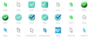
Check icons, often represented by a checkmark or a tick, are visual cues that indicate affirmation, completion, or approval. They are ubiquitous in user interfaces, from confirming selections on a form to signaling completed tasks in a to-do list. Because they are widely recognized, they are an invaluable tool for communicating with users without the need for additional text.
The Importance of Check Icons in UI Design
Understanding checkmark icons significance helps UI designers use them effectively. Here are some key reasons why check icons are essential in UI design:
- Clarity and Confirmation: Check icons provide immediate visual feedback, confirming that a user’s action has been successful or their choice has been selected.
- Universal Understanding: Check icons are universally recognized, transcending language barriers and allowing for clear communication in globalized applications.
- Efficiency: A simple checkmark can communicate a lot of information in a small space, helping keep interfaces clean and efficient.
Given these benefits, let’s dive into some best practices for incorporating check icons into your designs.
Best Practices for Using Check Icons
- Use Check Icons Sparingly While check icons are helpful, overusing them can lead to confusion or visual clutter. Ensure they are used where they make sense—such as indicating successful form submission, completed tasks, or confirming a user’s choice in a menu.
- Maintain Consistency Consistency is crucial in UI design. Ensure that check icons are consistent in size, color, and style across the application. A consistent design helps users quickly understand their meaning without second-guessing.
- Choose the Right Color Color plays a significant role in UI design, and the color of a check icon can convey additional meaning. Green is often associated with success or approval, while red typically indicates error or rejection. Make sure to choose a color that aligns with the context and user expectations.
- Provide Context Although check icons are widely understood, they still need context. For example, a checkmark next to a task in a to-do list indicates it’s completed, but a checkmark in a settings menu might mean that an option is selected. Always ensure there’s enough context for users to understand the check icon’s purpose.
- Ensure Accessibility Accessibility is a cornerstone of modern UI design. When using check icons, consider users with visual impairments or color blindness. Use additional cues, such as text or tooltips, to provide context and ensure the icon is accessible to everyone.
- Optimize for Touch Devices If you’re designing for touch devices, ensure that check icons are large enough to be easily tapped. Additionally, leave sufficient space around the icons to prevent accidental touches on adjacent elements.
Common Use Cases for Check Icons
To better understand how to use check icons effectively, let’s look at some common scenarios where they are employed in UI design:
- Forms and Data Entry: Check icons are often used to indicate successful validation of a form field, such as an email address or password that meets security requirements.
- Task Management Applications: In to-do lists and project management apps, check icons signify completed tasks. They provide a clear visual cue to users about their progress.
- E-commerce and Shopping Carts: Check icons can confirm that an item has been added to a shopping cart or a payment has been successfully processed.
- Settings and Preferences: In settings menus, check icons indicate that an option is selected or enabled.
- Confirmation Dialogs: Check icons can be used in confirmation dialogs to reassure users that an action has been completed successfully.
Avoiding Common Pitfalls
While check icons are a useful tool, there are some common pitfalls to avoid in their use:
- Ambiguity: Ensure that the meaning of the check icon is clear in its context. Avoid using it in ways that could be misinterpreted or lead to ambiguity.
- Inconsistency: Don’t change the style or color of check icons without a clear reason. Inconsistency can confuse users and disrupt the overall design.
- Lack of Feedback: When using check icons to indicate completed actions, ensure there’s appropriate feedback for users. This can be a simple animation or a sound to confirm the action.
Conclusion
Check icons might seem like a minor component of UI design, but they play a critical role in providing clarity and feedback to users. By following best practices and considering the context, designers can use check icons to enhance the user experience, improve accessibility, and maintain consistency across their applications. As with all elements of UI design, remember to test and iterate, ensuring that your use of check icons aligns with user expectations and contributes to a seamless and intuitive user experience.
Also, check posts about app mockups, responsive mockup design and UI/UX mockup design.